The One Bright Piece Rule for People Whose Wardrobe Is Mostly Neutral

Quick Answer: If your wardrobe is mostly neutral, buy bright pieces that sit in the same position every time - one bright item, everything else neutral, with the brightness placed where you want the eye to go. The colour should relate to your existing neutrals rather than fighting them: a warm bright with warm neutrals like camel and cream, a cool bright with black, grey, and navy. And buy the bright piece in a shape you already own in a neutral, because that is proof you will actually wear it.
You own three bright things. You bought them enthusiastically. They are all still folded, because every morning the answer to what goes with this is: apparently nothing.

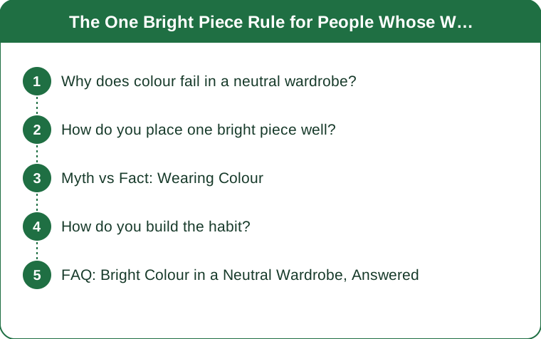
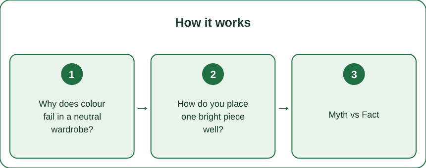
Why does colour fail in a neutral wardrobe?
Because a neutral wardrobe is built on interchangeability, and a bright piece breaks it. Every black, grey, and navy item works with every other one, which is the whole appeal. One coral top has a much smaller set of partners, and it competes with the habit that made the wardrobe work.
Undertone mismatches are the usual technical problem. A warm orange-based red sits awkwardly against cool charcoal and navy, while a cooler blue-based red sits against them comfortably. People frequently buy a colour they like in isolation without checking whether it belongs to the same temperature family as the clothes they own.
Brightness placement matters more than people expect. Colour draws the eye, so where you put it decides what the outfit emphasizes. A bright top brings attention upward toward the face; bright bottoms bring it down. Neither is wrong, but it should be a decision.
Unfamiliar shapes compound the problem. People buy colour in a style they would never buy in black, so the piece is both an unfamiliar colour and an unfamiliar cut - two new variables at once, and it stays in the drawer.
And the light changes across the year. A bright that looked correct in July’s overhead sun reads differently in the lower, warmer light of the coming weeks. Colours do not change, but the light falling on them does, and autumn light flatters deeper, warmer versions of the same hue.
How do you place one bright piece well?
Keep everything else neutral, without exception, while you are learning. One bright, two or three neutrals. It is a formula rather than a limitation, and it reliably looks considered rather than accidental.
Put the colour near your face if you want it to do the most work. A bright top, jacket, or scarf lifts your complexion and makes the whole outfit read as intentional. This is why so many people who own bright bottoms end up wearing them less.
Repeat the colour once, subtly, if you want to go further. A bright top and a bright detail on the shoe or bag is the intermediate step, and it works because it looks deliberate rather than incidental.
Match the bright to your existing neutral family. Cool brights - true reds, fuchsia, cobalt, emerald - sit comfortably with black, grey, and navy. Warm brights - coral, marigold, rust, warm orange - sit comfortably with camel, cream, brown, and olive. Getting this right removes most of the difficulty.
Buy it in a shape you already own. If you wear the same crew-neck knit in three neutrals, buy the bright one in that. It slots into the outfits you already make rather than requiring new ones.
And add texture rather than a second colour when the outfit looks flat. A ribbed knit, a chunky boot, or a denim jacket adds interest without introducing another colour to reconcile.

Myth vs Fact: Wearing Colour
Myth: Bright colours only work in summer. Fact: they work year-round, but the flattering versions shift. Deeper, warmer, more saturated brights - rust, burgundy, forest, mustard - read as seasonal now, while the same hue in a pastel version reads as leftover from July.
Myth: You have to know your season or colour analysis to wear colour. Fact: the practical version is much simpler - work out whether your existing neutrals lean warm or cool, and buy brights from the same family. That covers most of what formal analysis would tell you.
Myth: Two bright colours together always clash. Fact: they frequently work well, particularly when one is dominant and the other is an accent. But it is an advanced move, and it fails far more often than one-bright-plus-neutrals does.
Myth: A bright piece is a statement and should be saved for occasions. Fact: saving it is exactly why it never gets worn. A bright is most useful as a regular rotation item in an outfit you already know works.
Myth: If a colour is trending, it will suit you. Fact: trend colours are chosen by the industry, not by your complexion or your wardrobe. The version of a trend colour that is a shade deeper or a shade cooler is frequently the one that actually works on you.
How do you build the habit?
Start with one bright piece for a full month. Wearing the same bright top once a week for four weeks teaches you far more than owning six brights you never touch, and it identifies which of your neutrals it genuinely works with.
Photograph the combinations that work. A phone album of three outfits you liked removes the morning decision entirely, and it is the single most effective habit for anyone who finds getting dressed tiring.
Try it in daylight before committing. Fitting room lighting is unreliable, and stepping toward a window or outside is the standard trick for judging whether a colour is doing anything for your complexion.
Use accessories as the low-risk entry. A bright scarf, bag, or trainer introduces colour with almost no styling risk, and it is a sensible test before spending on a bright coat.
Buy quality in the colours you will repeat. Bright dyes fade faster than neutrals, particularly with hot washing and sun drying, so wash bright pieces cold, inside out, and dry away from direct sun.
And ignore the pieces that have never worked. Three unworn brights is data, not a moral failing. Pass them on, note what they had in common - usually an undertone or a shape - and buy the next one differently.
FAQ: Bright Colour in a Neutral Wardrobe, Answered
How do I add colour without buying a whole new wardrobe?
One bright piece, everything else neutral, in a shape you already own in a neutral. That single formula covers most outfits and requires no other purchases to work.
Which brights go with black and grey?
Cooler brights generally - true red, fuchsia, cobalt, emerald. Warmer brights like coral, marigold, and rust sit more comfortably with camel, cream, brown, and olive.
Can I wear bright colours in autumn?
Yes, though deeper and warmer versions of the same hue tend to read as seasonal while pastel versions can look out of place. The lower, warmer light of the coming weeks flatters saturated colour rather than washed-out colour.
Why do my bright clothes fade so fast?
Bright dyes are more vulnerable to heat, agitation, and sunlight than neutrals. Wash cold and inside out, avoid the tumble dryer, and dry away from direct sun - the difference over a year is substantial.
TL;DR:
- One bright piece plus neutrals is the formula, and it reliably looks intentional rather than accidental.
- Match the bright’s undertone to your existing neutrals: cool brights with black and navy, warm brights with camel and cream.
- Buy the bright in a shape you already own in a neutral - that is proof you will wear it.
- Put colour near your face when you want it to do the most work, and add texture rather than a second colour when an outfit looks flat.
- Wear one piece weekly for a month, photograph what works, and wash bright dyes cold and inside out.
Three unworn brights is information, not failure. Work out what they had in common and buy the next one differently.
Keep Reading
This article is for general informational and styling purposes only. Fit, sizing, and product availability may vary.