Why Bright Activewear Looks Different in Photos Than It Does in the Mirror

Quick Answer: Camera sensors and phone processing handle highly saturated colors differently than the human eye does, often either blowing out bright colors in direct sun or muting them in shade — which is why a bright set that looks perfect in a mirror can look off in a photo taken minutes later.
There’s a specific letdown that comes from loving how a bright color looks in person, then seeing the photo and wondering what happened — and it’s not really about the outfit at all.
Why Do Bright Colors Behave Differently in Photos?
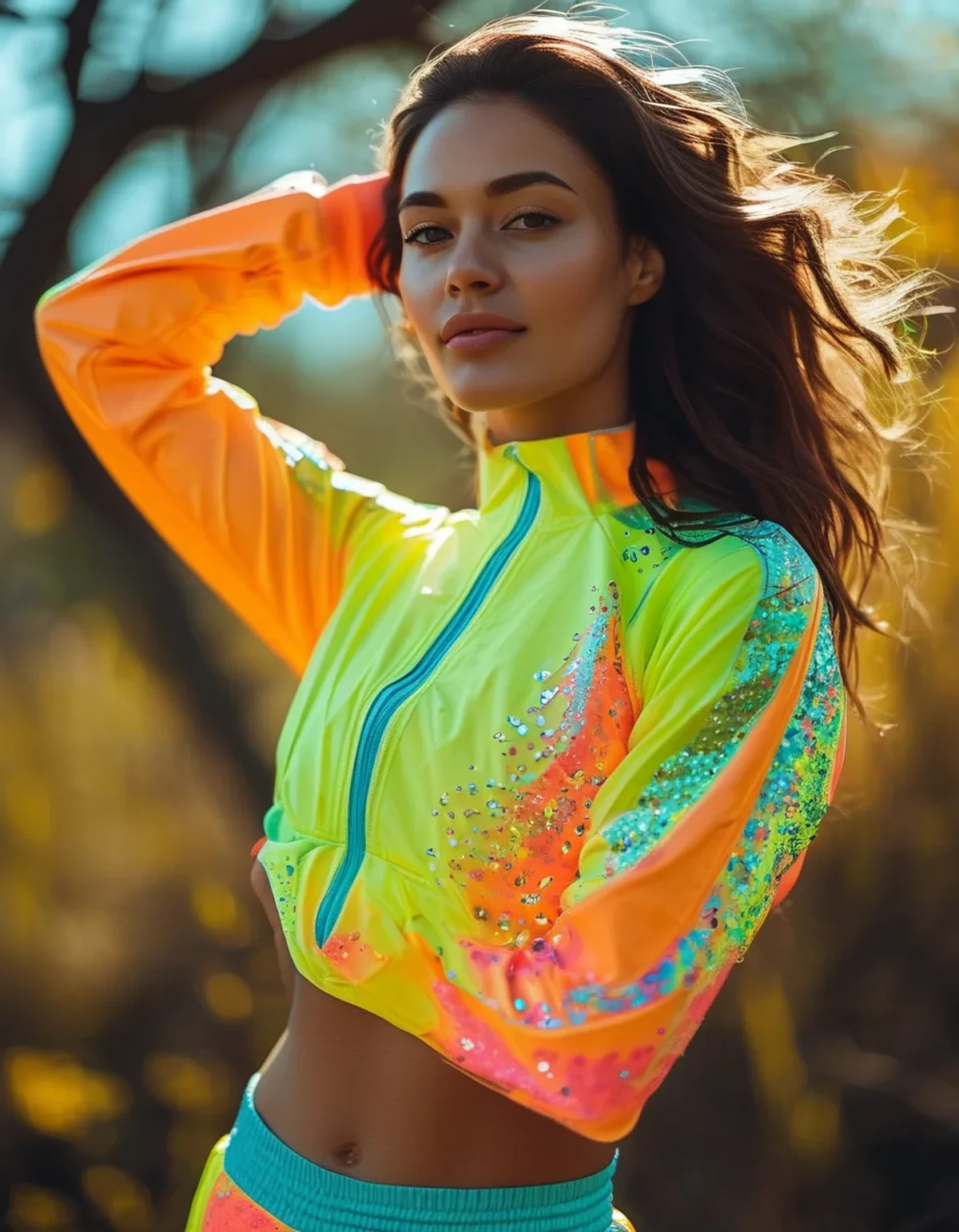
Camera sensors have a narrower dynamic range than the human eye, meaning they struggle more with very saturated, high-contrast colors — bright colors in direct sunlight can “blow out” into a flatter, less vibrant version of themselves once captured, while the same color in flat, overcast light often reads more true to what you saw in person.
Phone camera processing adds another layer: many phones apply automatic saturation and exposure adjustments that can mute or shift a bright color slightly to balance the overall image, which is why the exact same outfit can look different across different phone models.
Does Lighting Matter More Than the Color Itself?
Yes, significantly. Bright, direct midday sun tends to wash out saturated colors and create harsh shadows that fight with a bold outfit, while soft, diffused light (overcast days, golden hour, or shade) tends to preserve color accuracy and vibrance much more faithfully.
If a bright activewear photo is important to plan for — a trip, an event — golden hour or a bright but shaded spot will almost always photograph closer to how the color looks in person than harsh midday sun will.
Bright Color Mistakes That Age an Outfit in Photos
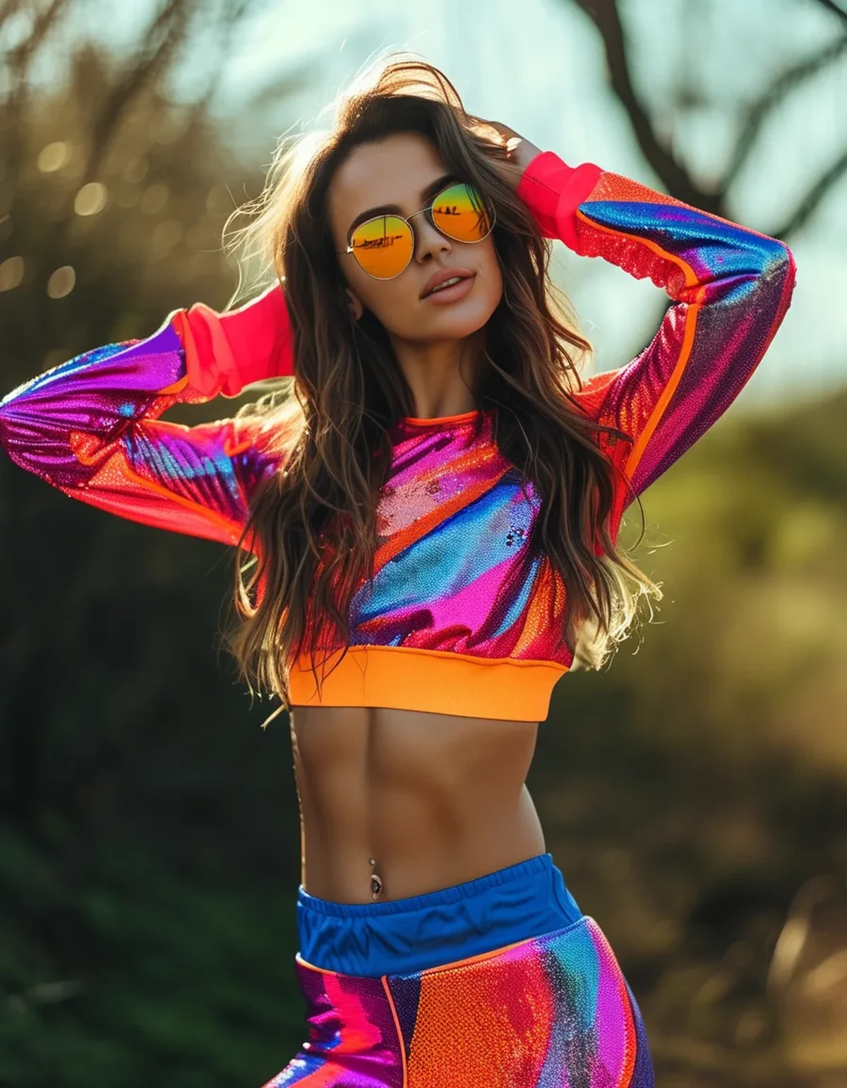
Mistake 1: Pairing two competing bright colors without a neutral to anchor them — this often reads as visually chaotic in photos even when it looks fine in person. Mistake 2: Shooting in harsh midday sun, which can blow out the exact color that looked best in the mirror. Mistake 3: Ignoring background color — a bright outfit against a similarly bright or clashing background competes for attention rather than standing out. Mistake 4: Over-relying on phone auto-adjustments instead of taking a quick test photo before a planned shoot to check how the color is actually reading that day.
How Do You Predict How a Color Will Photograph Beforehand?
Take a quick test photo in the same lighting condition you’ll actually be in before committing to an outfit for an event or trip — this catches most surprises before they matter, since lighting affects saturated colors more unpredictably than most people expect.
If a specific bright color has disappointed you in photos before, try it again in softer, more diffused light rather than assuming the color itself is the problem — often it’s the light, not the outfit.
FAQ: Bright Activewear Photography Questions, Answered
Why does my neon set look duller in photos than in person?
Phone camera processing and dynamic range limitations often mute highly saturated colors, especially in harsh direct light — it’s a camera limitation, not a flaw in the outfit.
What’s the best lighting for photographing bright activewear accurately?
Soft, diffused light — overcast days, shade, or golden hour — tends to preserve color accuracy better than harsh midday sun.
Should I avoid pairing two bright colors together for photos?
Not necessarily, but anchor them with a neutral (white, black, or beige) somewhere in the outfit to keep the photo from reading as visually chaotic.
TL;DR:
- Camera sensors handle saturated colors differently than your eyes do, especially in harsh light
- Soft, diffused lighting preserves bright color accuracy far better than direct midday sun
- Anchor competing bright colors with a neutral piece to avoid visual chaos in photos
- Take a quick test photo in real lighting before committing to an outfit for an important shoot
If a bright set has let you down in photos before, it’s worth blaming the lighting before the outfit — the fix is usually simpler than a full wardrobe rethink.
Keep Reading
This article is for general informational and styling purposes only. Fit, sizing, and product availability may vary.