The One Bright Color Mistake That Ages an Otherwise Great Outfit

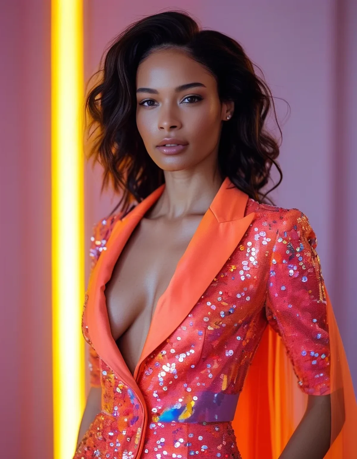
Quick Answer: Pairing a bright, saturated color with another bright, competing saturated color (rather than a neutral) is the most common mistake that reads as dated or chaotic — one bright anchor color paired with neutrals almost always looks more current and intentional.
Bright colors themselves aren’t the problem — it’s usually the pairing choice around them that pushes an outfit from bold and current into looking dated or try-hard.
Why does pairing two bright colors together tend to backfire?
Two competing saturated colors fight for visual attention rather than creating a clear focal point, and without a neutral to give the eye a resting place, the overall look reads as busy or chaotic rather than intentional. One dominant bright color with neutral supporting pieces reads as a deliberate styling choice.
What neutral pairings work best with a bright anchor piece?
Black, white, camel, and gray all work as reliable neutral partners for a bright piece, since none of them compete for saturation. The specific neutral matters less than committing to just one bright focal point — the mistake is rarely the neutral choice, it’s usually having two brights competing at once.

What Nobody Tells You About Styling Bright Colors
A bright color dates faster when it’s paired with another trend-driven bright than when it’s paired with a timeless neutral. Two of last season’s trending brights together can look specifically “of a moment” in a way that ages quickly, while a bright-plus-neutral combination tends to photograph and read as current for much longer.
Does this rule apply to prints and patterns with bright colors too?
Yes, and arguably more so — a bright printed piece already carries visual complexity, so pairing it with a second bright solid or pattern compounds the competing-attention problem even faster than two solid brights would.
FAQ: Bright Color Styling Questions, Answered
Can you ever successfully wear two bright colors together?
Yes, with intention — colors from the same family (two shades of a warm coral-red range, for example) or a deliberate color-blocking approach can work, but it requires more styling skill than a bright-plus-neutral pairing.
Does skin tone affect which bright colors work as an anchor piece?
Yes — warmer skin tones often suit warm brights (coral, tomato red) while cooler skin tones often suit cool brights (fuchsia, cobalt), though this is a general guideline, not a strict rule.
Is black always a safe neutral to pair with bright colors?
Usually, though very bright, warm colors sometimes look more current against a warm neutral like camel rather than stark black, depending on the season and overall look.
TL;DR:
- Two competing bright colors together is the most common outfit-aging mistake
- One bright anchor piece paired with a neutral reads as intentional, not chaotic
- The specific neutral matters less than committing to a single bright focal point
- This rule applies even more to bright prints, which already carry visual complexity
Keep Reading
This article is for general informational and styling purposes only. Fit, sizing, and product availability may vary.