How to Keep Wearing Bright Colour Into Autumn (Without Looking Out of Season)

Quick Answer: Bright colour reads seasonal in autumn when it is paired with a deeper neutral and carried in a heavier fabric. Cobalt, emerald, fuchsia and orange all work; pastels and neons are the ones that start looking out of place. The rule that does the most work: one bright piece against chocolate, charcoal, navy or forest rather than against white or pale grey.
There is no actual rule that colour disappears in September, but there is a real effect where the same bright piece that looked right in July looks slightly wrong in October. It is almost always the pairing and the fabric rather than the colour itself.
Why does bright colour look wrong in autumn?
Three specific things change, and none of them are the colour.
Light quality changes. Autumn light is lower-angled, warmer, and softer than summer light. Colours that were designed to hold up against high overhead sun can look flat or garish in it. This affects cool pastels most and warm saturated tones least.
The surrounding palette changes. In summer, a bright piece sits against other light colours, bare skin, and pale surroundings. In autumn it sits against darker clothing, darker streets, and a browner landscape. The same colour has a different amount of contrast around it, and high contrast is what reads as out of season.
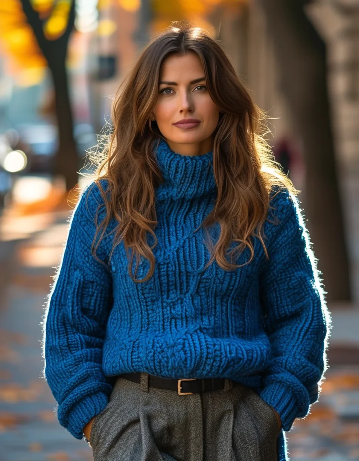
Fabric weight is the biggest and least-noticed factor. A fuchsia linen shirt reads summer. A fuchsia wool knit in exactly the same colour reads autumn. The fibre communicates the season more strongly than the hue does.
What this means practically: you do not need to change your colours. You need to change what the colour is made of and what sits next to it.
The colours that struggle most: cool pastels - baby pink, mint, pale lemon, powder blue. These are strongly associated with spring and summer and are hardest to carry into autumn regardless of fabric.
The colours that carry easily: anything saturated and slightly deep - cobalt, emerald, fuchsia, burnt orange, true red, mustard. These read richer rather than lighter, which is exactly what autumn light rewards.
The pairing rule that does most of the work
One bright piece against a deep neutral. That is the whole formula, and it covers the majority of transitional outfits.
The deep neutrals that work: chocolate brown, charcoal, navy, forest green, and black. Each of these makes a bright colour read as deliberate.
The neutrals that undermine it: white, cream, and pale grey. These are summer’s neutrals, and a bright piece against them keeps the whole outfit in a summer register no matter what the fabric is.
The single most effective swap: replace white with cream in September and cream with chocolate in October. It is the same outfit structure with a completely different seasonal reading.
Chocolate brown deserves specific mention because it has become the default autumn neutral and it is genuinely excellent with brights. Brown with cobalt, brown with fuchsia, brown with orange - all read current and none read like a summer outfit that got layered.
Proportion: the bright piece should be roughly a third of the outfit or less. A bright top with neutral bottoms and neutral shoes reads seasonal. Bright top and bright bottoms reads summer, in any fabric.
The exception worth knowing: full tonal brights - an entire outfit in one saturated colour - reads as a deliberate statement rather than as a seasonal error. It works because it removes contrast entirely, which is the opposite solution to the same problem.
Which brights work in which fabrics?
Knitwear is the most effective vehicle for bright colour in autumn, and it is where most people underuse it.
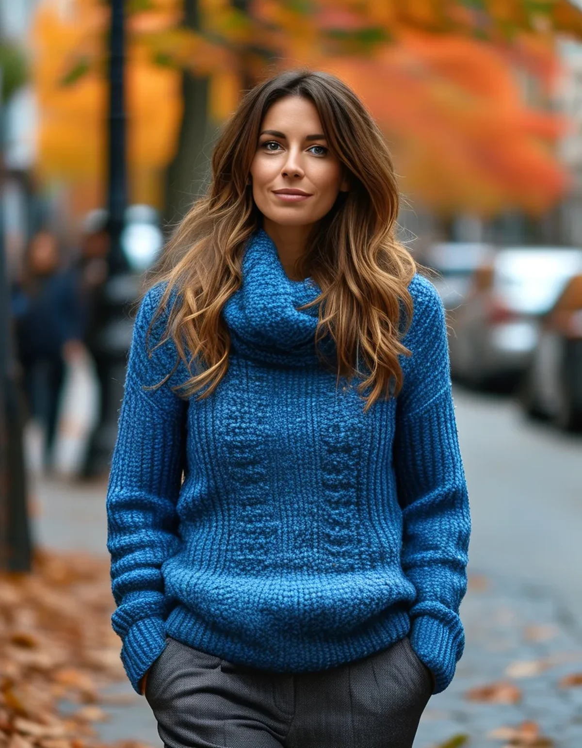
A bright wool or cotton knit reads unambiguously autumnal because the fabric does. Cobalt, emerald, fuchsia, and mustard all work beautifully as a knit and less well as a thin summer top in the same shade.
Wool and wool blends deepen colour visually. The same dye looks richer on wool than on cotton or synthetic, which is precisely what you want now.
Suede and leather in colour are strongly autumnal. A bright bag or shoe in suede reads seasonal in a way the same colour in patent or canvas does not.
Corduroy is having a moment and holds bright colour extremely well. The texture breaks up the surface and reduces the flatness that makes a bright colour look out of season.
Fabrics to move away from: linen, seersucker, broderie anglaise, and lightweight cotton voile. These read summer regardless of colour, which is why a bright linen shirt is the first thing to look wrong.
Satin sits in between. It works for evening in autumn and reads summery in daylight. A satin skirt in emerald with a chunky knit and boots is one of the more reliable transitional outfits available; the same skirt with a t-shirt and sandals is not.
The texture principle: the rougher and heavier the surface, the more autumnal the colour reads. This is why the identical shade can work in one garment and not another.
Myth vs Fact: Autumn Colour
Myth: Autumn means brown, burgundy, and mustard only. Fact: That is a marketing palette, not a rule. Cobalt, emerald, and fuchsia all work in autumn and look more distinctive because fewer people wear them then.
Myth: You can’t wear white after summer. Fact: You can, and winter white in a heavy fabric is a genuinely strong autumn look. What does not work is thin summer white as a neutral base against brights - that is a fabric issue, not a rule about the colour.
Myth: Bright colours wash you out in autumn light. Fact: Some do and some do not, and it depends on the specific shade against your colouring rather than the season. Softer, warmer autumn light is generally more forgiving than harsh summer sun.
Myth: Neon is the same as bright. Fact: Neon is a specific category with fluorescent pigments, and it is the hardest thing to carry into autumn because it reads as activewear or summer in almost any fabric. Saturated brights are a different proposition entirely.
Myth: If you wear one bright piece you should keep the rest plain. Fact: Broadly good advice, though texture is not the same as colour. A bright knit with a leopard print or a check in complementary neutrals reads as considered rather than busy.
Five transitional outfits built on one bright piece
1. Cobalt knit, chocolate trousers, brown boots. The clearest demonstration of the pairing rule. The blue reads rich rather than summery, and the brown does all the seasonal work.
2. Fuchsia knit, charcoal wide-leg trousers, black loafers. Fuchsia against grey is one of the strongest combinations available and gets used far less than it should. Keep everything else completely plain.
3. Emerald satin midi skirt, oatmeal chunky knit, tall boots. The satin would read summer with a t-shirt. With a heavy knit and boots it reads distinctly autumn, and the tonal depth of emerald does the rest.
4. Burnt orange knit, dark denim, white trainers. The most casual of the five and the easiest to wear. Burnt orange is close enough to the autumn palette to feel natural and bright enough to still count as colour.
5. Neutral outfit, one bright accessory. Charcoal or chocolate head to toe with a cobalt or red bag, or coloured boots. This is the lowest-commitment version and the easiest place to start if bright colour is not usually your thing.
The through-line in all five: one bright element, deep neutrals everywhere else, and at least one heavy-fabric piece. Change any of those three and the outfit shifts back toward summer.
Where to start if you own no bright autumn pieces: a knit. It is the single most useful thing to add, works in every one of the combinations above, and is the piece most likely to still be worn in three years.
FAQ: Bright Colour in Autumn Questions, Answered
Which brights are hardest to wear in autumn?
Cool pastels - baby pink, mint, powder blue, pale lemon - and true neons. Both are strongly associated with other seasons and neither deepens well in autumn light.
Can I wear two bright colours together?
Yes, and it works best when both are saturated and one is clearly dominant. Two pastels together is the combination that reads most out of season.
What’s the easiest bright piece to start with?
A knit, in cobalt or emerald. Both work with every deep neutral, both suit most colouring, and knitwear does the seasonal work automatically.
Does this apply to accessories too?
Accessories are the most forgiving place for bright colour year-round, because the proportion is small. A bright bag or shoe against a neutral outfit works in any season.
How do I stop a bright colour looking cheap?
Fabric quality shows more in saturated colour than in neutrals - poor dye and thin fabric are both more visible. It is worth spending more on a bright piece than on a plain one for exactly this reason.
TL;DR:
- Fabric weight communicates season more strongly than colour does - the same shade works as a knit and fails as linen
- Pair one bright piece with a deep neutral: chocolate, charcoal, navy or forest, never white or pale grey
- Saturated brights carry easily; cool pastels and neons are the ones to pack away
- Keep the bright to about a third of the outfit, or go fully tonal - the middle is where it goes wrong
- Chocolate brown is the most useful autumn neutral to pair with anything bright
If you add one thing: a bright knit in cobalt or emerald. It does the seasonal work for you.
Keep Reading
This article is for general informational and styling purposes only. Fit, sizing, and product availability may vary.