How to Carry Summer Brights into Autumn Without Looking Out of Season

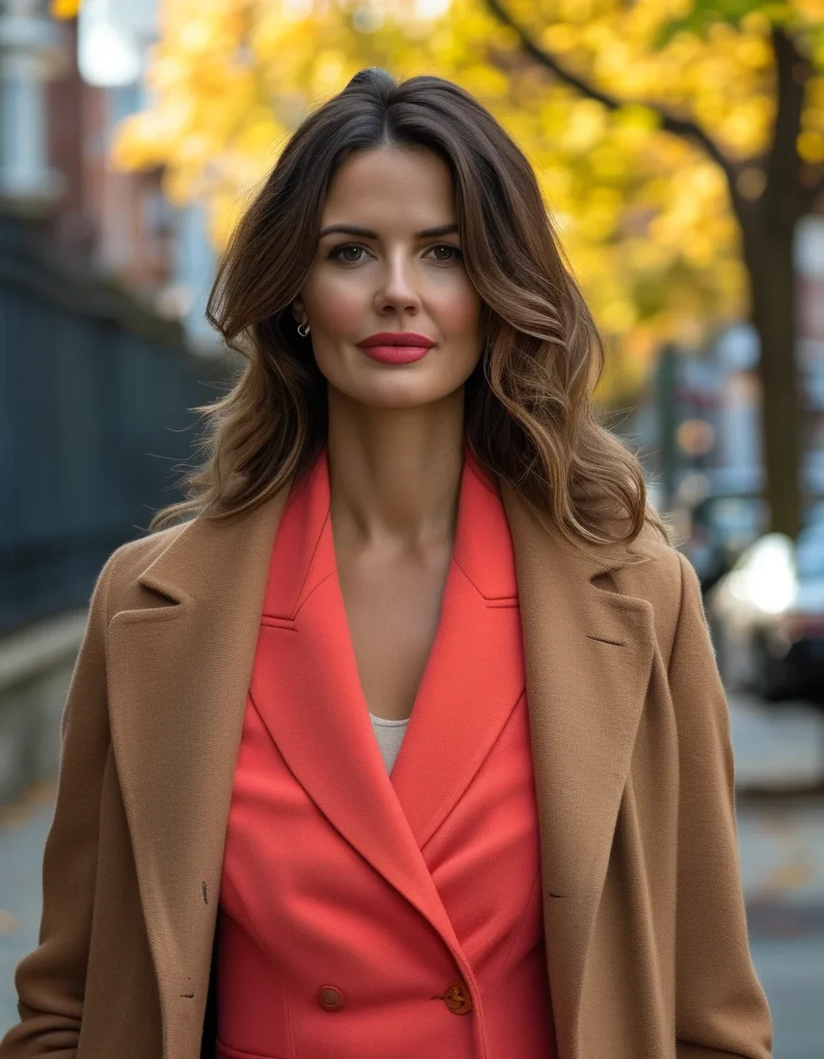
Quick Answer: Bright colours read as summery mainly because of what surrounds them - white, pale neutrals, and light fabrics. Pair the same bright with a deep or warm neutral instead, reduce it to one piece rather than two, and change the fabric weight, and it reads as autumn immediately. The colour is rarely the problem; the context is.
Packing away half your wardrobe in September because the calendar changed is an expensive habit, and most of it is unnecessary.
Why do brights suddenly look wrong in September?
Three reasons, and only one of them is about the colour itself.
The neutral you are pairing it with. A bright coral next to white and pale grey reads as summer, because that combination is the summer palette. The same coral next to chocolate brown, charcoal, or deep olive reads as autumn. The bright has not changed - its neighbour has.
The fabric weight. A neon tank in thin jersey reads as summer regardless of what you do around it. The same colour in a ribbed knit, a fleece, or a heavier cotton reads as seasonal. Texture and weight carry more seasonal signal than hue does.
The light. Autumn light is lower, warmer, and less intense. Colours that looked balanced under high summer sun can look slightly harsh under it, particularly cool-toned brights. This is genuinely a real effect and it is why the same top can look different in the mirror in September than it did in July.
What this means practically: you have three levers and only one of them requires giving up the colour. Changing the neutral is free and instant. Changing the fabric means choosing a different piece in a similar colour. Only the third lever - retiring the colour - is the one everyone reaches for first.
Which neutrals turn a bright into an autumn colour?
The deep and warm ones. This is the highest-value swap in the whole exercise.
Neutrals that make a bright read as autumn:
- Chocolate brown. The single most effective one, and currently everywhere. Brown next to almost any bright produces an autumn combination immediately
- Camel and tan. Warm, seasonal, and flattering next to coral, rust, and yellow in particular
- Deep olive. Works especially well with orange, pink, and bright blue
- Charcoal and true black. Reliable, and slightly harder than the warm neutrals - a bright next to black reads as bold rather than as seasonal, which is a different effect but a legitimate one
- Cream, but only the warm version. A warm cream works into October; a cool bright white does not
Neutrals that keep a bright looking like summer:
- Bright white
- Pale grey
- Light pastels
- Denim in a light wash
The specific test: hold the bright piece against a brown or olive item, then against a white one, and look at both in daylight. The difference in seasonal reading is immediate and much larger than most people expect.
The one-bright rule. In summer you can wear two brights together comfortably. In autumn, one bright with two neutrals is the proportion that works. It is not a rule so much as an observation about what looks intentional in lower light.
Which brights transition best?
The warm ones and the deep ones. Cool pastels are the genuine casualties.
Transitions easily:
- Rust, burnt orange, terracotta. These are effectively autumn colours already
- Deep coral and tomato red. Warm-toned, and excellent with brown
- Mustard and golden yellow. The most autumnal of the brights
- Emerald and forest-adjacent greens. Deep enough to read as seasonal
- Fuchsia and magenta. Surprisingly good in autumn, particularly with chocolate or charcoal - the depth is what carries it
- Cobalt. Works well against camel and olive
Struggles:
- Pastels of any kind - baby pink, mint, lilac, powder blue. These are the pieces that genuinely belong in the box
- Neon yellow-green, which is difficult in low light
- Very pale bright white, which reads as summer regardless of what it is next to
The pattern behind it: saturation and warmth transition; lightness does not. A bright, deep, saturated colour works in autumn. A light, airy version of the same hue does not, which is why fuchsia works and baby pink does not, even though they are the same family.
A useful reframe: you are not choosing between bright and neutral. You are choosing between light and deep. Autumn dressing tolerates almost any hue as long as it has enough depth.

Myth vs Fact: Bright Colours in Autumn
Myth: Autumn means earth tones only. Fact: Earth tones dominate autumn marketing because they photograph well against autumn backdrops. There is no rule, and a single bright against deep neutrals is more interesting than a head-to-toe neutral outfit.
Myth: You should not wear white after Labor Day. Fact: An outdated convention that nobody enforces. Winter white and cream are established autumn and winter choices. What actually shifts is the fabric - a light cotton white in November reads as out of season, while a cream knit does not.
Myth: Brights are less flattering in autumn light. Fact: Warm brights are arguably more flattering in warm low light. Cool-toned brights can look slightly harsher, which is a reason to favour the warm end rather than to abandon colour.
Myth: One bright piece is a statement and needs the rest to be plain. Fact: True in effect, though the reason is proportion rather than restraint. One bright against two or three deep neutrals gives the eye somewhere to land. Two brights compete, which reads as busy in low light where it read as playful in summer.
Myth: You need to buy autumn colours every year. Fact: This is the entire commercial argument for seasonal wardrobes. Changing which neutral you pair with does the same job for free, and it is genuinely the difference between an outfit that reads as September and one that reads as July.
What should you actually pack away?
Less than you think, and there is a useful sorting method.
Pack away:
- Pastels in light fabrics
- Anything sheer or linen in a pale colour
- Sandals and anything with cut-outs
- Very lightweight bright pieces that will not layer
Keep out, in a new context:
- Bright knits, sweatshirts, and anything with weight
- Saturated brights of any hue, to be worn as the single colour piece
- Bright outerwear, which is one of the best uses of colour in autumn precisely because everything else is dark
- Bright accessories - a bag or a scarf carries colour with none of the seasonal-fabric problem
The sorting question to ask about each piece: could I wear this with brown? If yes, it stays out. If the answer is no, it is probably a light summer piece and it can go.
The single most useful autumn purchase for someone with a bright wardrobe is a chocolate brown or deep olive layer - a knit, a jacket, or a coat. It converts every bright you own into an autumn outfit, which is a much better return than buying three new pieces in seasonal colours.
On storage: wash everything before it goes away, dry it fully, and store somewhere breathable rather than in plastic. Bright colours in particular fade if stored in direct light, and stains that are invisible now oxidise into visible marks over six months. This is the reason favourite summer pieces come out of the box in May looking worse than they went in.
One last note on brights in autumn: the low-light effect cuts both ways. Everything around you is getting darker, so a single bright piece stands out considerably more than it did in July. That is the argument for wearing it and the argument for wearing one at a time.
FAQ: Autumn Colour Questions, Answered
What is the easiest bright to wear in autumn?
Rust, mustard, and deep coral, because they are warm and saturated. Fuchsia is the surprise entry - it works very well against chocolate and charcoal.
Can I wear pastels in autumn at all?
In a heavier fabric and paired with a deep neutral, sometimes. A pastel knit with charcoal works better than a pastel cotton with white. Generally, though, pastels are the genuine seasonal casualties.
Is brown really better than black with brights?
For an autumn reading, yes - brown is warmer and reads as seasonal, while black reads as bold and year-round. Both work; they produce different effects.
How many bright pieces should be in one outfit?
One, with two or three neutrals. Two brights together works in summer light and tends to look busy in autumn light.
TL;DR:
- Brights read as summery because of the pale neutrals next to them, not because of the colour
- Swap white and pale grey for chocolate, camel, olive, or charcoal and the same piece reads as autumn
- Saturation and warmth transition; lightness does not - which is why fuchsia works and baby pink does not
- One bright with two or three neutrals is the autumn proportion
- Buy one deep brown or olive layer rather than a new wardrobe of seasonal colours
The test for every bright piece you own: could I wear this with brown? If yes, it stays out of the box.
Keep Reading
This article is for general informational and styling purposes only. Fit, sizing, and product availability may vary.