How to Wear Bright Colors in Activewear Without Looking Like a Traffic Cone
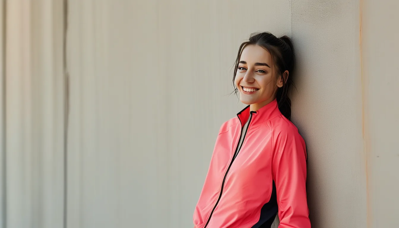
Quick Answer: Use the 60-30-10 rule: one dominant neutral (60%), one supporting color (30%), and your bright accent color (10%) — usually shoes or a bra top. That ratio reads intentional instead of chaotic.
You own the neon set. It’s been sitting in the drawer because the one time you wore it, top to bottom, you felt like you were dressed for a safety demonstration, not a workout. The color isn’t the problem — the ratio is.
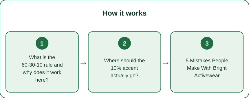
What is the 60-30-10 rule and why does it work here?
Borrowed straight from interior design, where it prevents rooms from looking like a paint sample explosion: 60% dominant neutral, 30% supporting tone, 10% bright accent.
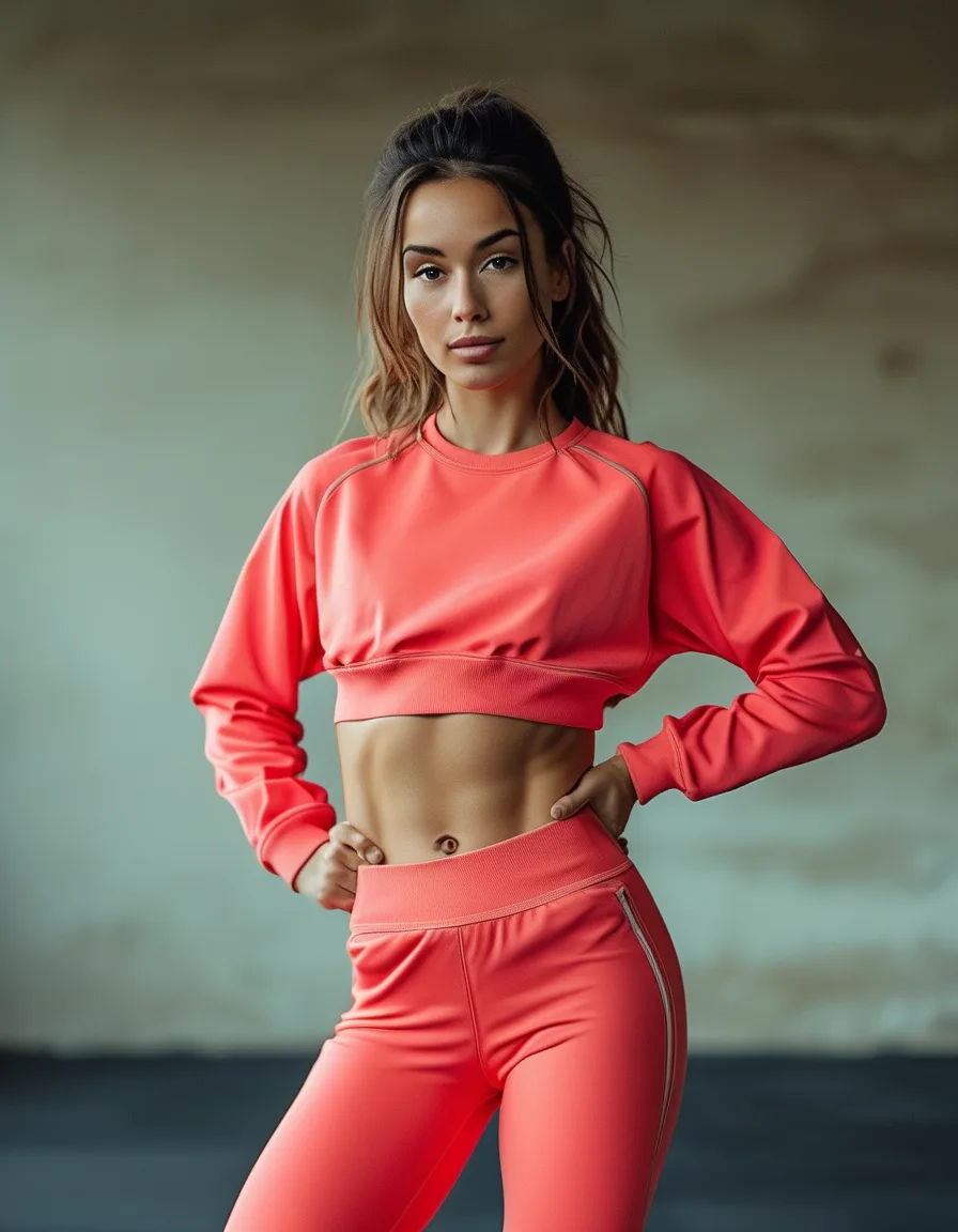
Applied to a gym outfit: black leggings (60%) + a heather grey tank (30%) + neon coral sports bra or shoes as your 10% pop. Your eye reads one clear focal point instead of scanning three competing colors — which is exactly why the same neon top feels loud alone but sharp against neutrals.
Where should the 10% accent actually go?
Shoes, a bra top peeking under a tank, or a hair accessory — anywhere that draws the eye to a single point rather than spreading color across your whole silhouette.
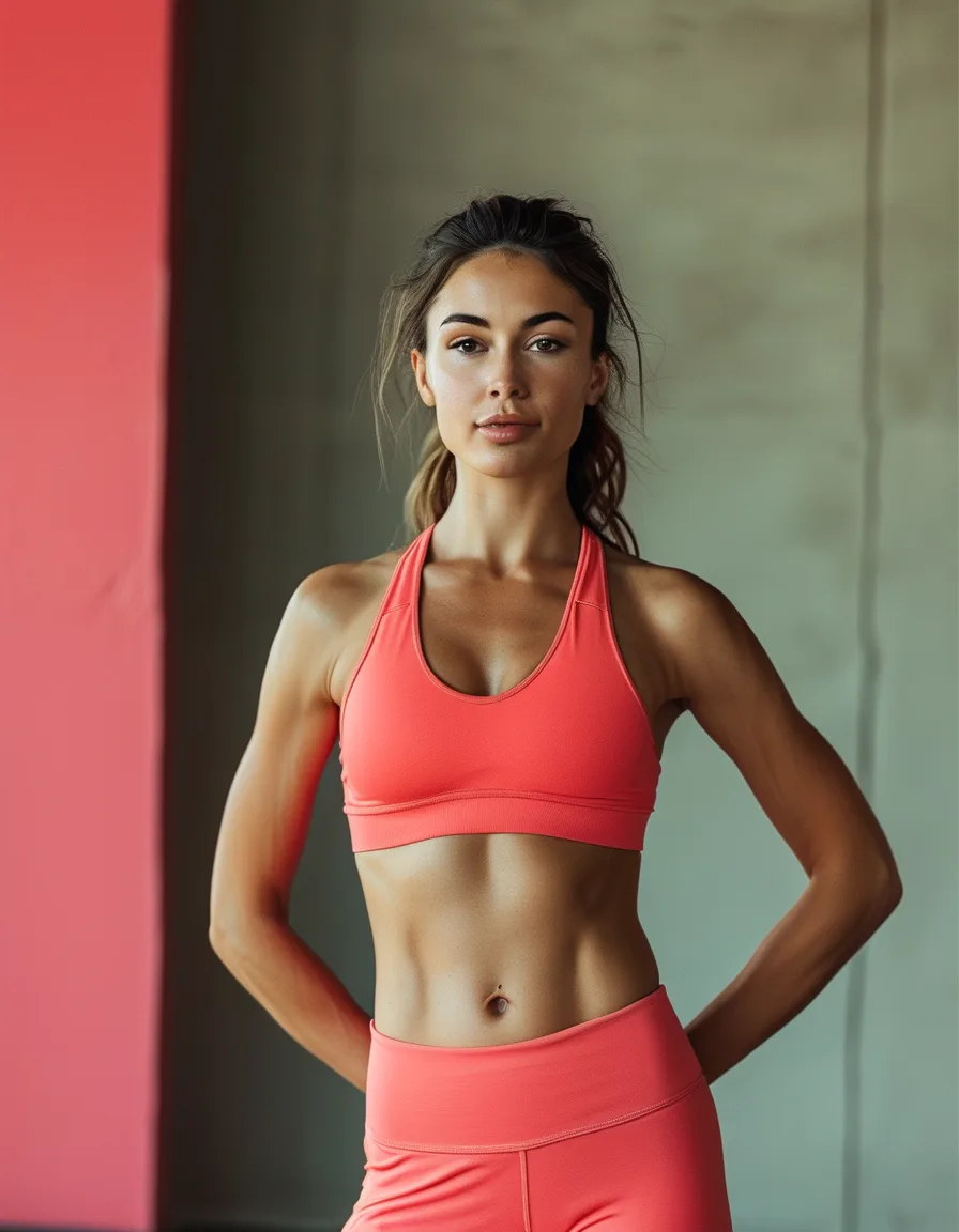
Avoid putting your bright accent on both top and bottom at once (neon top, neon leggings) unless you’re deliberately going full color-block — that’s a different, more advanced move, not the everyday version of this rule.
5 Mistakes People Make With Bright Activewear
1. Two brights, no neutral. Neon top + neon bottom with nothing to ground them reads chaotic, not bold.
2. Matching the print to the paint, not the palette. A single bold color works; a busy print in a bold color usually doesn’t — pick one loud element per outfit.
3. Skipping the mirror test in daylight. Gym lighting mutes color; check your combo in natural light too before committing.
4. Bright shoes with a bright top and nothing between. Anchor with a neutral bottom so the eye has somewhere to rest.
5. Avoiding brights entirely because of past mistakes. The fix is ratio, not avoidance — you don’t need to give up the color.
Does color actually affect how a workout feels, or is this just aesthetics?
There’s a real, if modest, psychological angle: bright colors are associated with higher energy and alertness in color-perception research, which is part of why so many performance brands lean into them for high-intensity lines.
Whether or not that translates to a measurably better set for you, there’s a simpler win — an outfit you feel confident in tends to get worn more often than one sitting untouched in a drawer, which is the real problem the neon set was having before today.
FAQ: Bright Activewear Questions, Answered
What neutral pairs best with bright activewear?
Black and charcoal give the strongest contrast and make the bright pop hardest. Warm beige or grey works if you want a softer, less high-contrast look.
Can I wear two bright colors together?
Yes, if they’re true complements (like coral and teal) and you keep the ratio close to 60-30-10 rather than a 50-50 split — one should still read as the lead color.
Is neon activewear only for high-intensity workouts?
No — the color doesn’t change the function. A neon accent works just as well for a walk or yoga class as it does for HIIT; it’s purely a styling choice.
TL;DR:
- 60% neutral, 30% supporting tone, 10% bright accent — that ratio is the whole trick
- Put your accent color in one spot (shoes, bra top), not spread top-to-bottom
- Check your combo in daylight, not just gym lighting
- Bright colors read as higher energy in color perception — a small real effect, plus you’ll actually wear it
The neon set isn’t the problem — wearing it without a neutral anchor is. Fix the ratio, not the color.
See It in Motion
Seen here: UPF 50+ Short Sleeve Rashguard Swim Shirt — shop it on bubblelime.com
Keep Reading
This article is for general informational and styling purposes only. Fit, sizing, and product availability may vary.