How to Wear a Bright Colour in Autumn Without Looking Like You Missed the Memo

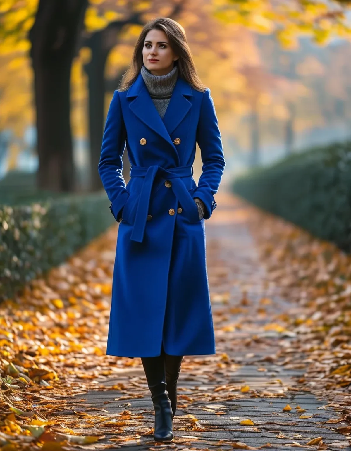
Quick Answer: A bright colour reads as autumnal when it is used in a small proportion, paired with a heavier fabric, and grounded by a deep neutral - charcoal, chocolate, navy, or olive rather than white. The same bright pink that looked like summer with white and mesh in July looks intentional with charcoal and a knit in October. What changes is not the colour but the texture and the proportion around it.
Seasonal colour rules are mostly nonsense. Seasonal texture rules are not.
Why does the same colour suddenly look wrong in autumn?
Because you are reading the fabric and the surrounding colours, not the hue itself.
Summer brights come with summer signals: lightweight fabrics, mesh panels, white and pale grey pairings, bare skin, and high shine. Those signals are what say summer, not the colour. A bright coral in a thin, shiny performance fabric next to white reads as July regardless of the date.
Change the surrounding signals and the same coral works. Put it against charcoal, in a heavier knit or a matte woven, with covered arms and a boot, and it reads as a deliberate accent in an autumn outfit.
The light itself changes too. Autumn daylight is lower-angle and warmer, and colours look different in it. Colours with a warm base - rust, mustard, tomato, saffron - flatter that light; cool-based fluorescents fight it. This is not a rule about what you are allowed to wear, but it explains why some brights feel effortless in October and others feel loud.
And the context around you changes. Everyone else has moved into darker clothing, so a bright piece stands out more than it did in July. That is either the point or the problem, depending on how much of it you are wearing.
Adjustment 1: Change the proportion
The most reliable single change. Summer allows a bright as the whole outfit; autumn wants it as roughly a fifth of it.
The workable ratio is one bright piece against two or three neutral ones. A bright jacket over charcoal layers. Bright leggings under a long dark coat. A bright top under a neutral gilet, with only a strip showing.
Why it works: a small area of high-saturation colour against a large area of low-saturation colour reads as an accent, which is a deliberate design decision. A large area of bright colour reads as a garment choice, and in autumn that choice looks summery.
Where to place the bright piece matters too. Near the face - a scarf, a beanie, a top collar - the colour does the most work for the least area. At the feet, it reads as sportier; a bright trainer with an otherwise neutral outfit is one of the easiest versions of this.
The accessory route is the lowest-risk version: a bright beanie, gloves, a gym bag, or a water bottle. Small area, large effect, no commitment.
One exception worth knowing: full head-to-toe in a single bright colour also works, because monochrome is its own deliberate statement. It is the middle ground - a bright top with unrelated bright trainers and a neutral bottom - that looks accidental.
Adjustment 2: Change the fabric weight and finish
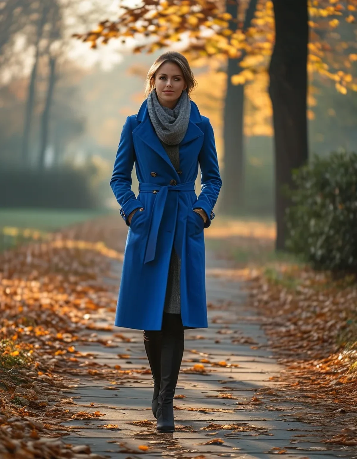
Texture is what carries the season, and it does more than the colour choice.
Autumn textures: ribbed knit, brushed fleece, wool blends, heavy jersey, matte woven shells, corduroy, suede. Summer textures: mesh, thin smooth jersey, anything with a sheen, lightweight woven nylon.
A bright colour in an autumn texture is automatically seasonal. A cobalt cable knit is not a summer garment in any sense, regardless of how bright the cobalt is. A cobalt mesh vest is a summer garment even in November.
Practical translations for activewear:
- Swap the bright mesh-panelled top for a bright brushed-fleece half-zip
- Swap the shiny bright legging for a matte thick-knit one
- Swap the bright lightweight windbreaker for a bright quilted or fleece-lined jacket
The shine test is the quickest one. Hold the piece under a light. If it reflects, it reads as summer; if it absorbs, it reads as autumn. This one check sorts most wardrobes faster than any colour theory.
Layering adds texture automatically. Even a summer-weight bright top becomes seasonal under an open flannel shirt or a knit gilet, because the outfit now contains autumn fabrics even if the bright piece does not.
Adjustment 3: Change the neutral you pair it with
This is the change that surprises people most, because the instinct is to reach for white or light grey.
White with a bright colour reads as summer, consistently. High contrast, high brightness, and a strong association with warm-weather sportswear.
The neutrals that pull a bright into autumn:
- Charcoal and deep grey - the most versatile, works with every bright
- Chocolate brown - currently everywhere and unusually good with orange, pink, and cream
- Navy - handles cool brights, particularly cobalt, fuchsia, and emerald
- Olive and khaki - excellent with orange, rust, coral, and mustard
- Black - always works, though the contrast is high and it can read sporty
Cream and oatmeal sit in the middle. Warmer than white, so they work better than white does, but they still lighten the whole outfit considerably.
The pairing test: put the bright piece against a charcoal item and against a white item, side by side. The difference in how seasonal it looks is usually obvious immediately, and it is a better guide than any rule about which colours belong to which season.
A useful autumn combination to try: bright colour, chocolate brown, and cream, in roughly a 20-50-30 split. It is warm, current, and works with almost any bright you already own.
FAQ: Bright Colours in Autumn, Answered
Are there brights I genuinely should not wear after summer?
Nothing is off limits. Very cool-based fluorescents - highlighter yellow, acid green - are the hardest to make look seasonal, because they fight the warmer autumn light. They work best in very small areas.
What is the easiest bright to wear in autumn?
Anything with a warm base: rust, tomato red, saffron, burnt orange, or a warm pink. These sit naturally against autumn neutrals and in autumn light.
Can I wear bright activewear to run in the dark?
Yes, and brightness helps, though for genuine visibility you want reflective detail rather than colour - colour is invisible under headlights at night in a way reflective strips are not.
Does the shine test work for all fabrics?
It is a good general guide. The exception is technical outerwear, where a matte performance shell can be entirely seasonal despite being lightweight.
How do I stop a bright outfit looking like gym kit outside the gym?
One bright piece, a matte fabric, a neutral bottom half, and non-athletic shoes. The shoes do more than anything else to move an outfit out of the sportswear category.
TL;DR:
- Colour is not what makes an outfit look summery - texture, shine, and pairings are
- Use one bright piece against two or three neutral ones, roughly a fifth of the outfit
- Swap smooth and shiny for ribbed, brushed, and matte, and the same colour reads as autumn
- Pair with charcoal, chocolate, navy, or olive instead of white
- Near the face is where a small bright area does the most work
Most bright activewear gets shelved in September for no good reason. Put the same pieces against a darker neutral, add one heavier layer, and they carry through the whole cold season - which is exactly when a bit of colour is worth the most.
See It in Motion
Seen here: High Waist Yoga Leggings with Side Pockets — shop it on bubblelime.com
Keep Reading
This article is for general informational and styling purposes only. Fit, sizing, and product availability may vary.