Why the Bright You Loved in July Looks Wrong in September Light

Quick Answer: Autumn light is lower in the sky, warmer at the edges of the day, and much flatter under cloud - which mutes cool pastels and lifts saturated warm and jewel tones. Brights that survive the shift are the ones with depth: cobalt, emerald, rust, mustard, deep coral. The ones that fall apart are chalky pastels and neons, which need strong overhead sun to read as intended.
It happens every year and it always feels like a personal failure. The mint tank you wore constantly in July comes out on a September morning and looks washed out and slightly sad. You did not develop better taste overnight. The light source changed, and colour is entirely a conversation between a fabric and the light hitting it.
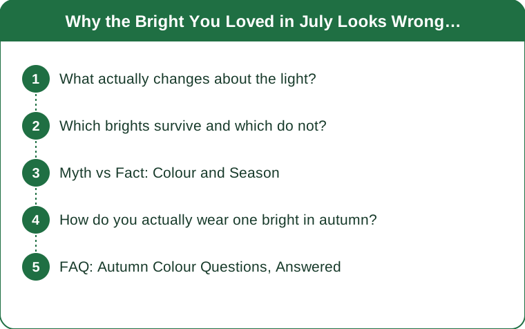
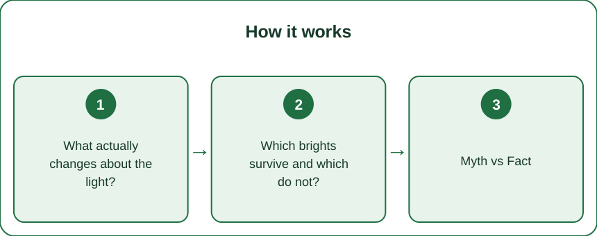
What actually changes about the light?
Three things, and each affects colour differently.
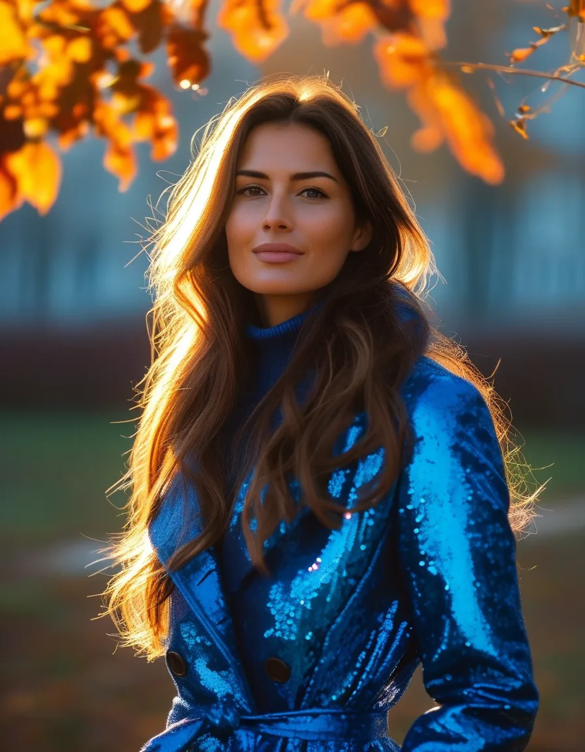
The sun sits lower. As the sun drops toward the horizon, its light passes through more atmosphere, which scatters the shorter blue wavelengths and lets more red and orange through. That is why autumn light feels warmer - it genuinely contains proportionally more long-wavelength light.
Cloud cover flattens everything. Overcast light is diffuse, cooler in colour temperature, and produces almost no shadow. Without shadow, fabric loses the contrast that makes texture and depth visible, so everything reads flatter. This is why a colour that looked complex in July looks like a single flat block in October - the light stopped giving it any structure.
Days get shorter at both ends. More of your outdoor time happens near sunrise and sunset, which are the warmest, most tinted parts of the day, rather than at midday when light is closest to neutral.
The combined effect: warm colours get warmer and richer, cool pastels get greyer, and anything that relied on strong overhead sun to look vivid stops looking vivid.
Which brights survive and which do not?
The distinction is depth, not hue. Saturated colours with some darkness in them hold up; colours that are essentially white with a tint do not.
Hold up well in autumn light:
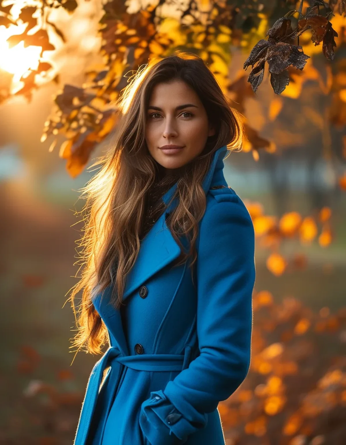
- Cobalt and royal blue - enough saturation to read clearly under cloud
- Emerald and forest green - depth carries them through flat light
- Rust, terracotta, and burnt orange - actively enhanced by warm low sun
- Mustard and ochre - the same, and they pick up the colour of the season around them
- Deep coral and raspberry - the darker end of pink survives where the pale end does not
- True red - reads strongly in almost any light
Struggle:
- Chalky pastels - mint, baby blue, lilac. They rely on brightness rather than saturation, so flat light removes the only thing holding them up.
- Neons - they look extraordinary in strong sun and slightly synthetic under cloud, because the fluorescence needs UV to work.
- Pale yellow - close to the colour of low autumn light itself, so it disappears into the background.
The test: photograph the garment outdoors on an overcast day. If it looks flat and colourless on your phone screen, that is roughly what everyone else is seeing.
Myth vs Fact: Colour and Season
Myth: You have to put away bright colours in autumn. Fact: You have to change which brights, not whether. Autumn light is exceptionally kind to saturated colour - it is pastels that struggle.
Myth: Everyone should wear autumn colours in autumn. Fact: Seasonal colour palettes describe what suits your complexion, not what month it is. A cool-toned person does not become warm-toned in October.
Myth: Black is always safe. Fact: Black absorbs almost all light, so in flat autumn conditions it reads as a shape rather than a garment and shows every piece of lint. Charcoal, deep navy, and dark brown often photograph and read better.
Myth: Bright colours make you look bigger. Fact: Fit and contrast do far more than hue. A well-fitted bright piece with a clear silhouette reads better than a baggy dark one.
Myth: You cannot mix two brights. Fact: You can, if they share a depth level. Cobalt and rust work together because they are equally saturated. Cobalt and mint clash because one has depth and the other does not - the eye reads it as a mistake rather than a choice.
How do you actually wear one bright in autumn?
The most reliable structure is one bright piece against a grounded neutral, with a third mid-tone linking them.
Ground it with a warm neutral. Camel, cream, chocolate, and stone all sit well with autumn light. Cool greys can flatten a bright under cloud, because grey plus flat light equals two things with no depth.
Put the bright where you want the eye. Near the face if you want it to read as your colour; at the feet or on a bag if you want it as an accent. A bright mid-layer visible under an open coat is one of the easiest ways to carry colour in a season where the outer layer is usually dark.
Match the fabric weight to the season. The same cobalt in a summer-weight jersey and in a chunky rib knit reads completely differently. The knit looks like autumn; the jersey looks like a leftover. This is the fix most people never try - keep the colour and change the texture.
Repeat it once. A bright that appears in exactly one place can look accidental. The same colour picked up in a small accessory - a scarf, a sock, a lip - makes it read as intentional.
FAQ: Autumn Colour Questions, Answered
Can you wear neon in autumn?
You can, and it will look considerably less vivid under cloud because fluorescent dyes rely on UV. Neon works best as a small accent in autumn rather than as the main piece.
What colours look best in low autumn light?
Saturated colours with depth - cobalt, emerald, rust, mustard, deep coral, and true red. Warm low sun actively enhances the orange and yellow families.
Why do my clothes look different outside than in the shop?
Shop lighting is usually bright, warm, and directional, which flatters almost everything. Always check a colour in daylight, ideally near a window or outside the door, before deciding.
TL;DR:
- Autumn light is lower, warmer at the edges, and flatter under cloud - which changes what every colour reads as.
- Depth is what survives: cobalt, emerald, rust, mustard, deep coral, true red.
- Chalky pastels and neons need strong sun and fall flat without it.
- Keep the colour and change the fabric weight - the same bright in a knit reads as autumn.
Nothing in your wardrobe stopped working. Half of it just needs a different sky, and the other half is about to look better than it did all summer.
Keep Reading
This article is for general informational and styling purposes only. Fit, sizing, and product availability may vary.